Prototype: Time Series Clustering

Country-level tourism recovery trajectories in Singapore

1. Introduction

This prototype follows a strict code -> result -> explanation rhythm. Each section shows one piece of code, one visible result, and one interpretation.

The clustering unit in this module is a country time series, not a month. In other words, each country is treated as one monthly arrival trajectory, and the goal is to identify which countries share similar recovery patterns in Singapore’s inbound tourism.

The page first looks for the processed files expected by the final project:

  • data/processed/clustering_country_wide.csv
  • data/processed/clustering_country_long.csv

If those files are not present during local rendering, the page falls back to the raw workbook so that the prototype remains executable while the project is being assembled.

The method used here is a practical hierarchical clustering workflow built on comparable monthly trajectories:

  1. index each series to a common baseline;
  2. z-score the indexed values across time for comparability;
  3. cluster the country series with a distance matrix and Ward linkage;
  4. use silhouette diagnostics to choose k;
  5. interpret the final clusters with a membership table, representative profile plot, and a China placement check.

2. Load Packages

The first step is to load the packages used throughout the prototype.

packages <- c("readxl", "dplyr", "ggplot2", "cluster", "knitr")
invisible(lapply(packages, library, character.only = TRUE))

package_table <- data.frame(
  Package = packages,
  Version = vapply(packages, function(pkg) as.character(packageVersion(pkg)), character(1))
)

knitr::kable(package_table, align = c("l", "l"))
Package Version
readxl readxl 1.4.5
dplyr dplyr 1.2.0
ggplot2 ggplot2 4.0.2
cluster cluster 2.1.8.1
knitr knitr 1.51

The package table confirms that the prototype uses a small, base-project-friendly set of tools for reading data, shaping trajectories, clustering country series, and reporting results.

3. Import The Series Files

The next step is to import the processed clustering inputs if they already exist. If not, the page reconstructs a compact country-level series table from the raw workbook for local checks.

find_project_root <- function(start = getwd()) {
  current <- normalizePath(start, winslash = "/", mustWork = TRUE)

  repeat {
    if (file.exists(file.path(current, "_quarto.yml"))) {
      return(current)
    }
    parent <- dirname(current)
    if (identical(parent, current)) {
      stop("Project root not found. Expected to locate _quarto.yml.")
    }
    current <- parent
  }
}

first_existing <- function(paths) {
  found <- paths[file.exists(paths)][1]
  if (length(found) == 0 || is.na(found) || !nzchar(found)) {
    NA_character_
  } else {
    found
  }
}

rel_to_project <- function(path, root) {
  if (is.na(path) || !nzchar(path)) {
    return(NA_character_)
  }
  root_norm <- normalizePath(root, winslash = "/", mustWork = TRUE)
  path_norm <- normalizePath(path, winslash = "/", mustWork = TRUE)
  rel <- sub(
    paste0("^", gsub("([][{}()+*^$|\\\\?.])", "\\\\\\1", root_norm), "/?"),
    "",
    path_norm
  )
  if (identical(rel, path_norm)) {
    return(basename(path_norm))
  }
  rel
}

clean_series_name <- function(x) {
  x <- gsub("^Visitor Arrivals: ", "", x)
  x <- gsub("^\\s+|\\s+$", "", x)
  x
}

coerce_series_numeric <- function(df, cols) {
  for (col in cols) {
    df[[col]] <- as.numeric(gsub(",", "", df[[col]]))
  }
  df
}

project_root <- find_project_root()
source(file.path(project_root, "app", "R", "data_utils.R"))
analysis_start <- as.Date("2017-01-01")
analysis_end <- as.Date("2025-12-01")

wide_processed_path <- first_existing(c(
  file.path(project_root, "data", "processed", "clustering_country_wide.csv"),
  file.path("data", "processed", "clustering_country_wide.csv")
))
long_processed_path <- first_existing(c(
  file.path(project_root, "data", "processed", "clustering_country_long.csv"),
  file.path("data", "processed", "clustering_country_long.csv")
))
raw_workbook_path <- first_existing(c(
  file.path(project_root, "data", "raw", "visitor_arrivals_full_dataset.xlsx"),
  file.path("data", "raw", "visitor_arrivals_full_dataset.xlsx")
))

if (!is.na(wide_processed_path)) {
  country_wide <- read.csv(wide_processed_path, check.names = FALSE, stringsAsFactors = FALSE)
  country_wide$date <- as.Date(country_wide$date)
  country_wide <- country_wide |>
    dplyr::filter(date >= analysis_start, date <= analysis_end)
} else {
  raw_wide <- readxl::read_excel(raw_workbook_path, sheet = "My Series")
  raw_wide$date <- as.Date(raw_wide[[1]])
  raw_wide <- raw_wide |>
    dplyr::filter(date >= analysis_start, date <= analysis_end)

  fallback_series <- c(
    "Visitor Arrivals: China",
    "Visitor Arrivals: India",
    "Visitor Arrivals: Malaysia",
    "Visitor Arrivals: Australia",
    "Visitor Arrivals: Japan",
    "Visitor Arrivals: Philippines",
    "Visitor Arrivals: United Kingdom",
    "Visitor Arrivals: Germany",
    "Visitor Arrivals: Thailand",
    "Visitor Arrivals: Hong Kong SAR (China)"
  )
  available_series <- intersect(fallback_series, names(raw_wide))
  country_wide <- raw_wide |>
    dplyr::select(date, dplyr::all_of(available_series))
  names(country_wide) <- c("date", clean_series_name(names(country_wide)[-1]))
}

series_cols <- setdiff(names(country_wide), c("date", "year", "month", "quarter", "period"))
series_cols <- series_cols[vapply(country_wide[series_cols], is.numeric, logical(1))]
country_wide <- coerce_series_numeric(country_wide, series_cols)

if (!is.na(long_processed_path)) {
  country_long <- read.csv(long_processed_path, stringsAsFactors = FALSE)
  country_long$date <- as.Date(country_long$date)
  country_long <- country_long |>
    dplyr::filter(date >= analysis_start, date <= analysis_end)
} else {
  country_long <- data.frame(
    date = rep(country_wide$date, times = length(series_cols)),
    country = rep(series_cols, each = nrow(country_wide)),
    arrivals = as.vector(as.matrix(country_wide[series_cols]))
  )
  country_long$year <- as.integer(format(country_long$date, "%Y"))
  country_long$month <- as.integer(format(country_long$date, "%m"))
  country_long$indexed_arrivals <- ave(country_long$arrivals, country_long$country, FUN = function(x) x / x[1] * 100)
  country_long$zscore_arrivals <- ave(country_long$arrivals, country_long$country, FUN = function(x) as.numeric(scale(x)))
}

china_series <- series_cols[grepl("china", series_cols, ignore.case = TRUE)][1]
if (is.na(china_series) || !nzchar(china_series)) {
  stop("Unable to identify the China series in the clustering input.")
}

import_summary <- data.frame(
  Item = c(
    "Wide input",
    "Long companion",
    "Analysis window",
    "Number of countries",
    "Months",
    "China series"
  ),
  Value = c(
    ifelse(is.na(wide_processed_path), "Derived from raw workbook", rel_to_project(wide_processed_path, project_root)),
    ifelse(is.na(long_processed_path), "Derived from wide input", rel_to_project(long_processed_path, project_root)),
    paste(format(analysis_start, "%Y-%m"), "to", format(analysis_end, "%Y-%m")),
    length(series_cols),
    nrow(country_wide),
    china_series
  )
)

knitr::kable(import_summary, align = c("l", "l"))
Item Value
Wide input data/processed/clustering_country_wide.csv
Long companion data/processed/clustering_country_long.csv
Analysis window 2017-01 to 2025-12
Number of countries 10
Months 108
China series china

The import summary confirms that the prototype works on a clean monthly window and that the clustering input is a compact country-level table rather than a month-level feature matrix.

4. Confirm The Clustering Unit

Before clustering, it is useful to inspect the country series that will be included in the model.

country_summary <- country_long |>
  dplyr::group_by(country) |>
  dplyr::summarise(
    first_month = format(min(date), "%Y-%m"),
    last_month = format(max(date), "%Y-%m"),
    missing_arrivals = sum(is.na(arrivals)),
    mean_arrivals = round(mean(arrivals, na.rm = TRUE), 1),
    .groups = "drop"
  ) |>
  dplyr::arrange(dplyr::desc(mean_arrivals))

knitr::kable(country_summary, align = c("l", "l", "l", "r", "r"))
country first_month last_month missing_arrivals mean_arrivals
china 2017-01 2025-12 0 170309.2
india 2017-01 2025-12 0 78913.4
malaysia 2017-01 2025-12 0 73716.6
australia 2017-01 2025-12 0 70752.1
philippines 2017-01 2025-12 0 46600.8
japan 2017-01 2025-12 0 40778.4
united kingdom 2017-01 2025-12 0 34490.8
thailand 2017-01 2025-12 0 29527.5
hong kong sar china 2017-01 2025-12 0 24142.1
germany 2017-01 2025-12 0 21386.2

This table shows that each row is a country series with a common monthly span. That is exactly the right unit for time series clustering because the model is now grouping recovery trajectories instead of individual months.

5. Build Comparable Trajectories

The next step is to put every country onto a common scale. Indexing starts each series at 100, and z-scoring then makes the trajectories comparable for distance-based clustering.

country_indexed <- country_wide
for (col in series_cols) {
  first_value <- country_wide[[col]][which(!is.na(country_wide[[col]]))[1]]
  country_indexed[[col]] <- country_wide[[col]] / first_value * 100
}

trajectory_summary <- data.frame(
  Country = series_cols,
  Start_value = round(sapply(series_cols, function(col) country_wide[[col]][1]), 1),
  End_value = round(sapply(series_cols, function(col) country_wide[[col]][nrow(country_wide)]), 1),
  Recovery_ratio = round(
    sapply(
      series_cols,
      function(col) country_wide[[col]][nrow(country_wide)] / country_wide[[col]][1]
    ),
    3
  ),
  Indexed_end = round(sapply(series_cols, function(col) country_indexed[[col]][nrow(country_indexed)]), 1)
)

knitr::kable(
  trajectory_summary |>
    dplyr::arrange(dplyr::desc(Recovery_ratio)),
  align = c("l", "r", "r", "r", "r")
)
Country Start_value End_value Recovery_ratio Indexed_end
philippines philippines 46187 65491 1.418 141.8
malaysia malaysia 84504 116067 1.374 137.4
india india 80062 96629 1.207 120.7
australia australia 115930 127468 1.100 110.0
united_kingdom united_kingdom 46364 45761 0.987 98.7
germany germany 37068 34756 0.938 93.8
japan japan 53377 42592 0.798 79.8
thailand thailand 36813 26805 0.728 72.8
hong_kong_sar_china hong_kong_sar_china 34436 21355 0.620 62.0
china china 316805 172688 0.545 54.5

The trajectory summary shows why normalization is necessary. The countries are measured on the same scale, but their growth paths differ enough that raw values alone would overstate the largest markets.

country_scaled <- country_indexed
country_scaled[series_cols] <- scale(country_scaled[series_cols])

series_matrix <- t(as.matrix(country_scaled[series_cols]))
rownames(series_matrix) <- series_cols

The standardized matrix is now ready for a distance-based clustering model where each row is one country trajectory and each column is one month.

6. Diagnose The Number Of Clusters

The first diagnostic is a summary table of candidate k values from 2 to 6.

cluster_distance <- dist(series_matrix, method = "euclidean")
cluster_tree <- hclust(cluster_distance, method = "ward.D2")

within_cluster_distance <- function(labels, dmat) {
  d <- as.matrix(dmat)
  total <- 0
  for (grp in unique(labels)) {
    idx <- which(labels == grp)
    if (length(idx) > 1) {
      total <- total + sum(d[idx, idx][upper.tri(d[idx, idx])])
    }
  }
  total
}

candidate_k <- 2:6
k_diagnostics <- do.call(
  rbind,
  lapply(candidate_k, function(k) {
    labels <- cutree(cluster_tree, k = k)
    sil <- silhouette(labels, cluster_distance)
    data.frame(
      k = k,
      mean_silhouette = round(mean(sil[, "sil_width"], na.rm = TRUE), 3),
      within_cluster_distance = round(within_cluster_distance(labels, cluster_distance), 1),
      min_cluster_size = min(table(labels))
    )
  })
)

knitr::kable(k_diagnostics, align = c("r", "r", "r", "r"))
k mean_silhouette within_cluster_distance min_cluster_size
2 0.199 107.2 5
3 0.287 67.3 2
4 0.228 45.3 1
5 0.197 30.0 1
6 0.146 20.0 1

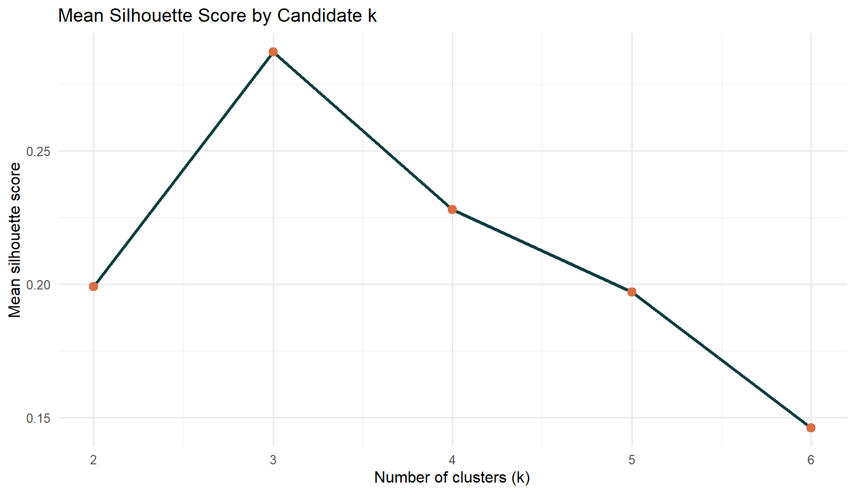
The diagnostics already point to a compact solution with a small number of clusters. In this dataset, k = 3 gives the best balance between separation and interpretability.

6.1 Diagnostic Plot

The second diagnostic is the silhouette trend across candidate k values.

ggplot(k_diagnostics, aes(x = k, y = mean_silhouette)) +
  geom_line(color = "#0f3d3e", linewidth = 1.1) +
  geom_point(color = "#d86f45", size = 2.8) +
  scale_x_continuous(breaks = candidate_k) +
  labs(
    title = "Mean Silhouette Score by Candidate k",
    x = "Number of clusters (k)",
    y = "Mean silhouette score"
  ) +
  theme_minimal(base_size = 12)
Figure 1

The plot confirms that k = 3 is the strongest practical choice. It separates the countries cleanly enough to be useful while still leaving room for a meaningful market-state interpretation.

7. Fit The Final Hierarchical Model

With the diagnostics in hand, the final clustering model can be fitted using three clusters.

selected_k <- 3
final_labels <- cutree(cluster_tree, k = selected_k)

prototype_panel <- list(
  raw_wide = country_wide[, c("date", series_cols)],
  normalized_wide = country_indexed[, c("date", series_cols)],
  matrix = series_matrix,
  dates = country_wide$date,
  series = series_cols,
  normalization = "indexed"
)

cluster_solution <- summarize_cluster_solution(
  panel = prototype_panel,
  cluster_id = final_labels,
  distance_matrix = cluster_distance,
  china_series = china_series
)

knitr::kable(
  cluster_solution$summary |>
    dplyr::select(
      cluster,
      cluster_label,
      n_series,
      representative_series,
      avg_end_index,
      avg_trough_index,
      avg_rebound_multiple
    ),
  align = c("l", "l", "r", "l", "r", "r", "r")
)
cluster cluster_label n_series representative_series avg_end_index avg_trough_index avg_rebound_multiple
Cluster 1 Delayed recovery 3 japan 65.4 0.0 7324.986
Cluster 2 Stronger rebound 5 philippines 116.5 0.1 5957.703
Cluster 3 Broad recovery 1 2 germany 96.2 0.0 10034.912

The final solution produces three interpretable blocks, but the richer point is that they are not just different groups of countries. They also reflect different recovery strengths. The summary table now shows which cluster rebounds furthest, which one experienced the deepest trough, and which country acts as the representative pattern for each group.

8. Show Cluster Membership

The next table lists every country and its final cluster assignment.

membership_table <- cluster_solution$membership |>
  dplyr::select(
    series,
    cluster,
    cluster_label,
    silhouette,
    end_index,
    trough_index,
    rebound_multiple
  ) |>
  dplyr::arrange(cluster, dplyr::desc(end_index), series)

knitr::kable(membership_table, align = c("l", "l", "l", "r", "r", "r", "r"))
series cluster cluster_label silhouette end_index trough_index rebound_multiple
japan Cluster 1 Delayed recovery 0.192 79.8 0.0 1703.680
hong_kong_sar_china Cluster 1 Delayed recovery 0.149 62.0 0.0 10677.500
china Cluster 1 Delayed recovery 0.300 54.5 0.0 9593.778
philippines Cluster 2 Stronger rebound 0.329 141.8 0.1 2046.594
malaysia Cluster 2 Stronger rebound 0.151 137.4 0.1 1209.031
india Cluster 2 Stronger rebound 0.285 120.7 0.0 8052.417
australia Cluster 2 Stronger rebound 0.052 110.0 0.0 18209.714
thailand Cluster 2 Stronger rebound 0.202 72.8 0.3 270.758
united_kingdom Cluster 3 Broad recovery 1 0.581 98.7 0.0 2691.824
germany Cluster 3 Broad recovery 1 0.626 93.8 0.0 17378.000

This membership view is the direct model output that the Shiny app should expose. It now does more than list cluster IDs: it also shows whether each country finishes the window strongly, how deep its trough becomes, and how much it rebounds from that trough.

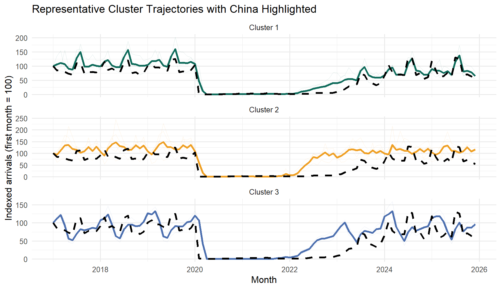
9. Show Representative Cluster Profiles

To make the clusters easier to interpret, the next plot shows the average indexed trajectory of each cluster over time, with China highlighted on top of its cluster profile.

china_line <- data.frame(
  date = country_indexed$date,
  indexed_value = country_indexed[[china_series]],
  series = china_series
)

ggplot(cluster_solution$plot_data, aes(x = date, y = value, color = cluster, group = interaction(series, type))) +
  geom_line(
    data = subset(cluster_solution$plot_data, type == "Series"),
    alpha = 0.14,
    linewidth = 0.35
  ) +
  geom_line(
    data = subset(cluster_solution$plot_data, type == "Cluster mean"),
    linewidth = 1.15
  ) +
  geom_line(
    data = china_line,
    aes(x = date, y = indexed_value),
    inherit.aes = FALSE,
    color = "black",
    linewidth = 1.2,
    linetype = "dashed"
  ) +
  scale_color_manual(values = c("Cluster 1" = "#0f6b5b", "Cluster 2" = "#ef9f23", "Cluster 3" = "#4c6faf")) +
  labs(
    title = "Representative Cluster Trajectories with China Highlighted",
    x = "Month",
    y = "Indexed arrivals (first month = 100)",
    color = "Cluster"
  ) +
  facet_wrap(~cluster, ncol = 1, scales = "free_y") +
  theme_minimal(base_size = 12) +
  theme(legend.position = "none")

This plot is now closer to what the final app should show: all member trajectories sit faintly in the background, the cluster mean gives the dominant pattern, and China is highlighted as a dashed reference line. That makes it much easier to tell whether China is representative of its group or slightly offset from it.

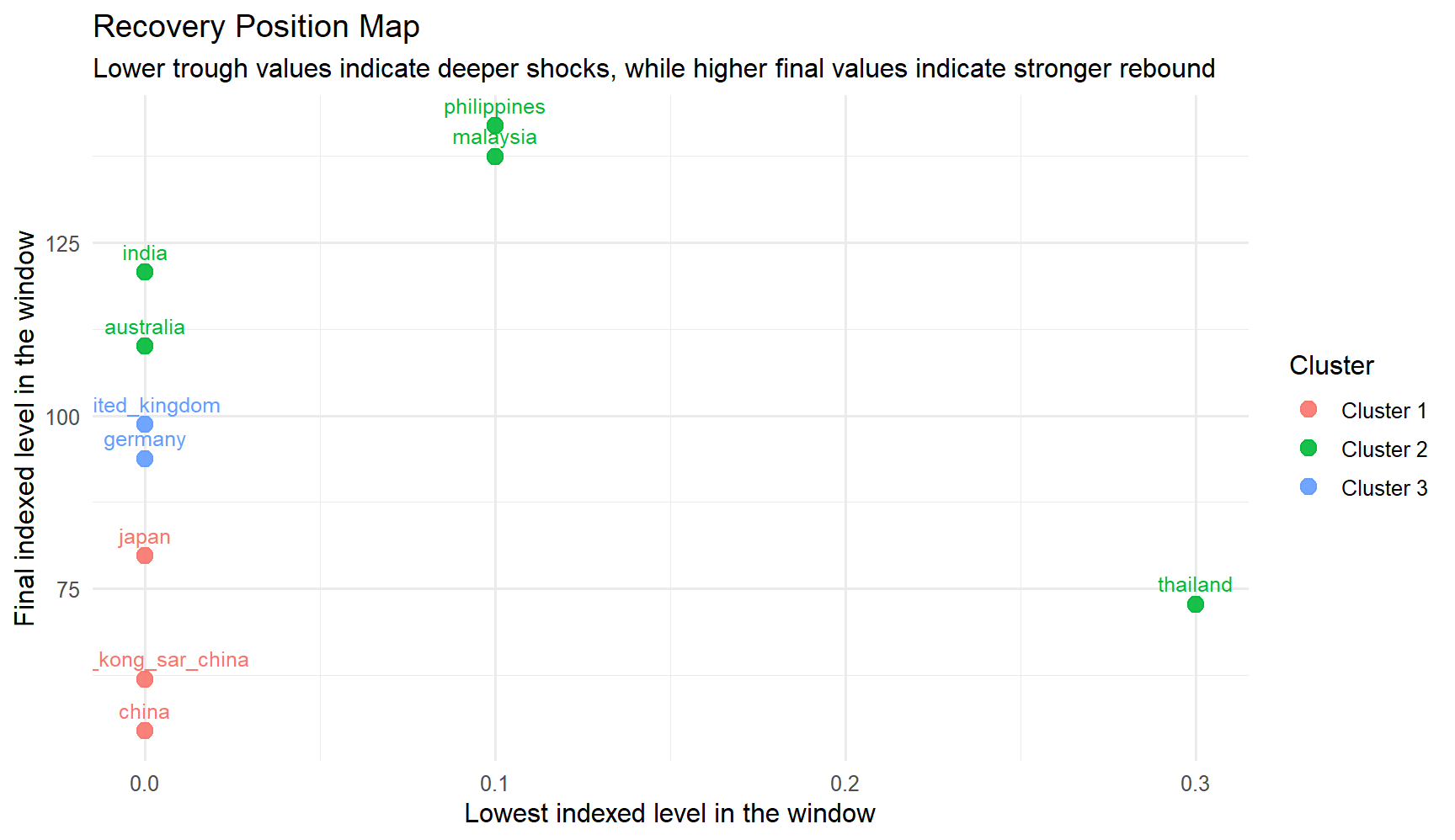
10. Compare Recovery Strength Across Countries

The next chart turns the clustering result into a recovery comparison. Countries that fell lower on the x-axis experienced a deeper trough, while countries that sit higher on the y-axis end the window from a stronger position.

ggplot(
  cluster_solution$series_features,
  aes(x = trough_index, y = end_index, color = cluster, label = series)
) +
  geom_point(size = 3.2, alpha = 0.9) +
  geom_text(vjust = -0.8, size = 3.3, show.legend = FALSE) +
  labs(
    title = "Recovery Position Map",
    subtitle = "Lower trough values indicate deeper shocks, while higher final values indicate stronger rebound",
    x = "Lowest indexed level in the window",
    y = "Final indexed level in the window",
    color = "Cluster"
  ) +
  theme_minimal(base_size = 12)

This view adds analytical depth because it separates two ideas that line charts often blur together: how hard each market was hit, and how strongly it recovered by the end of the selected window. The clusters are not just visually different; they also occupy different recovery positions.

11. Interpret China’s Placement

China belongs to the North Asia cluster, together with Japan and Hong Kong SAR (China). The next table shows that cluster and orders the members by their distance to China in the standardized trajectory space.

knitr::kable(
  cluster_solution$china_context |>
    dplyr::select(series, cluster, cluster_label, distance_to_china, end_index, trough_index),
  align = c("l", "l", "l", "r", "r", "r")
)
series cluster cluster_label distance_to_china end_index trough_index
china Cluster 1 Delayed recovery 0.000 54.5 0
japan Cluster 1 Delayed recovery 4.994 79.8 0
hong_kong_sar_china Cluster 1 Delayed recovery 5.014 62.0 0

China falls in Cluster 1 (Delayed recovery). Its closest peers in the selected set are japan, hong_kong_sar_china, and the representative series for this cluster is japan.

This is the most important interpretive message in the clustering module. China remains central to the story, but the model does not treat it as a standalone exception. Instead, it places China inside a specific recovery family, which helps the final application compare it to the right peers rather than to every market at once.

12. UI Design Implications

The clustering prototype should expose controls that let the user change the country set, the normalization choice, and the number of clusters without breaking the workflow.

ui_map <- data.frame(
  Control = c(
    "Country series selector",
    "Year window",
    "Normalization mode",
    "Cluster count k",
    "Run button",
    "Insight cards",
    "Recovery position map"
  ),
  Purpose = c(
    "Choose the series that will be treated as trajectories",
    "Keep the analysis window aligned with the monthly data",
    "Switch between raw, indexed, and z-scored trajectories",
    "Test whether the grouping should be more or less granular",
    "Trigger clustering only when the user is ready",
    "Explain cluster quality and China's placement in plain language",
    "Compare shock depth and end-of-window recovery strength"
  ),
  Output = c(
    "Membership table",
    "Comparable time-series matrix",
    "Diagnostic table and profile plot",
    "Cluster summary and China placement",
    "Updated cluster assignments and representative profiles",
    "Cluster narrative and China narrative",
    "Recovery metrics table and position plot"
  )
)

knitr::kable(ui_map, align = c("l", "l", "l"))
Control Purpose Output
Country series selector Choose the series that will be treated as trajectories Membership table
Year window Keep the analysis window aligned with the monthly data Comparable time-series matrix
Normalization mode Switch between raw, indexed, and z-scored trajectories Diagnostic table and profile plot
Cluster count k Test whether the grouping should be more or less granular Cluster summary and China placement
Run button Trigger clustering only when the user is ready Updated cluster assignments and representative profiles
Insight cards Explain cluster quality and China’s placement in plain language Cluster narrative and China narrative
Recovery position map Compare shock depth and end-of-window recovery strength Recovery metrics table and position plot

This UI mapping is the bridge from the prototype page to the final Shiny module. The refinement here is that the app should not stop at showing a cluster ID. It should also explain what the cluster means, how China fits into it, and how recovery strength differs across the grouped markets.